Key Takeaways
- Reusable templates reduce repetitive report design work.
- Consistent branding makes consulting reports more professional.
- Industry-specific visuals make reports feel tailored.
- Canva makes report cover customization more flexible.
- The project led to an ongoing report design retainer.
Why Report Design Matters
Consulting firms invest significant time in researching businesses, evaluating performance, and preparing recommendations. But even valuable insights can lose their impact when presented in a poorly designed report.
For Ferguson Alliance, a consulting firm delivering business assessments to its clients, the challenge was creating reports that looked as professional as the expertise behind them.
Their existing reports were prepared in Microsoft Word. While functional for documentation, the format made it difficult to create visually refined covers that could be easily adapted for different clients.
Ferguson Alliance needed more than a redesigned cover. They needed a consistent, reusable report design that would strengthen their brand presentation without adding unnecessary work to every new assessment.
AutoBizz helped turn that requirement into a practical design solution.
The Challenge
Every business assessment is different. The client, industry, report details, and supporting imagery change with each engagement.
But the consulting firm's identity should remain consistent.
Creating a completely new cover for every assessment would be time-consuming. Using the same generic design for every client, on the other hand, could make the reports feel disconnected from the businesses being assessed.
Ferguson Alliance needed a flexible design structure that could accommodate both.
We focused on three priorities:
Professional presentation: Give the reports a polished appearance comparable to established consulting publications.
Brand consistency: Maintain Ferguson Alliance's visual identity across different client assessments.
Easy customization: Allow the team to update images, company details, and report dates without redesigning the entire cover.
The objective was to make every new report feel tailored to its recipient while keeping the design process manageable.

What Makes a Professional Consulting Report?
A consulting report cover should communicate credibility before the reader reaches the first page of analysis.
To establish the right direction, we examined how leading consulting firms, including McKinsey and BCG, structure their business publications.
Several design principles stood out.
Visual hierarchy matters more than decoration. The report title, company identity, and supporting information should be immediately distinguishable.
Industry relevance creates context. A manufacturing assessment should visually communicate something different from a technology or financial services report.
Consistency builds recognition. Repeated use of typography, colors, and layout structures makes a firm's reports feel like part of the same professional system.
We applied these principles to Ferguson Alliance's existing brand rather than recreating another consulting firm's design.
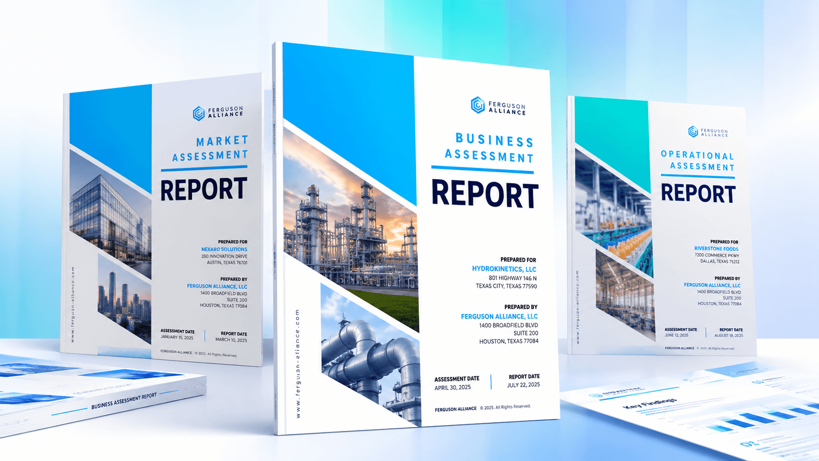
The resulting direction used their blue (#00ADEF), black (#000000), Montserrat, and Roboto Condensed typography, alongside a structured layout and industry-specific photography.
The goal wasn't to make the report look like McKinsey's. It was to achieve the same level of visual clarity while keeping Ferguson Alliance's identity recognizable.
The Solution: One Design, Multiple Reports
The most important decision wasn't simply how the cover would look. It was how Ferguson Alliance could reuse it.
We explored multiple design directions and developed three prototypes for client review. The client preferred one direction but wanted selected elements from the other versions incorporated into the final design.
The approved cover brought together a clear report title, prominent branding, relevant photography, and dedicated sections for client information.
However, a polished design alone wouldn't solve the recurring design problem.
The original reports were maintained in Microsoft Word, which wasn't ideal for editing the geometric layouts, overlapping images, and typography used in the new design.
We therefore created the cover in Canva, giving Ferguson Alliance a more flexible way to update its visual elements while preserving the established structure.
For each new assessment, the team could replace:
Client name and business details
Industry-specific photography
Assessment and report dates
Other report-specific information
The overall layout, brand colors, and typography could remain consistent.
We also prepared PDF-based guidance showing how the finalized cover could fit into the broader report presentation.
Instead of treating each report as a separate design project, Ferguson Alliance now had a reusable foundation for future assessments.
The Results: An Ongoing Partnership
The initial engagement delivered more than a client-approved cover. It gave Ferguson Alliance a consistent visual direction for its business assessments and a more practical approach to report customization.
The solution created several benefits:
Consistent branding: Reports could follow the same professional visual identity across different clients.
Simpler customization: Client details, imagery, and dates could be updated without recreating the cover.
Industry flexibility: The same design structure could support assessments across different business sectors.
Reusable design assets: A standardized cover reduced the need to develop a new visual direction for every engagement.
But the most significant outcome came after the initial project.
Impressed with the overall work, Ferguson Alliance brought AutoBizz into an ongoing retainer engagement to enhance the design and presentation of its client assessment reports.
What began as a single report cover became a broader partnership supporting the firm's recurring reporting needs.
The engagement showed how a focused design improvement could create value beyond the original deliverable.
How to Improve Your Business Report Design
If your business regularly produces assessment reports, research documents, proposals, or client presentations, the right design approach can improve both presentation quality and the preparation workflow.
Here are five principles worth following.
1. Design for repeated use
Build a consistent structure that accommodates different clients and industries. A good template should reduce repetitive work rather than introduce additional formatting tasks.
2. Keep the brand recognizable
Typography, colors, spacing, and layout should follow the same visual rules across reports, even when the content changes.
3. Make customization straightforward
Identify which elements need to change for each report and make those areas easy to edit without affecting the rest of the design.
4. Choose tools based on the workflow
Microsoft Word may be appropriate for writing and editing the report, while Canva can offer greater flexibility for visual cover design. Choose tools your team can maintain consistently.
5. Think beyond the cover
A professional cover creates the first impression, but typography, tables, charts, and page layouts throughout the report should reinforce the same quality.
The objective isn't to make every report look identical. It's to create a recognizable presentation standard that works across different business contexts.
Frequently Asked Questions
Why should consulting firms use reusable report templates?
Is Canva better than Microsoft Word for business reports?
What should a professional business assessment report cover include?
Can the same report design work for different industries?
If you have questions, contact us. Email at support@autobizz.com.